
Themes and fonts
A theme gives a whole video one look: a palette, fonts, a corner radius, a motion style and named presets per element, the way a brand kit and text styles do in a design tool. Swap the theme and every element that uses it is restyled, without touching the edit.
See it in: Brand spot in any theme: one theme prop restyles the titles, and the free-code parts read the same palette, fonts and radius from THEMES[theme].
The theme is the theme prop of the composition. Elements use it through $tokens and style presets:
<Composition fps={30} width={1920} height={1080}
  theme={{
    extends: "midnight",
    palette: { primary: "#ff5a1f" },
    fonts: { heading: "Playfair Display" },
    motion: "snappy",
    styles: { title: { hero: { size: 120, weight: 700, color: "$primary" } } },
  }}>
  <Track id="main">…</Track>
  <Track id="graphics" layout="free">
    <Title id="kicker" start={0.5} style="kicker">NEW</Title>
    <Title id="name" start={0.5} style="hero">Shed</Title>
    <Shape id="card" start={0.5} shape="rectangle" width={720} height={180} style="card" />
    <Svg id="mark" start={1} content={'<svg viewBox="0 0 24 24"><path d="…" fill="$accent"/></svg>'} />
  </Track>
</Composition>
Because the theme lives in the file, the model writes it, and an editor changes it with one undoable action.
What a theme holds
| Part | What it is | Used as |
|---|---|---|
extends | A built-in theme to start from: midnight (the default), paper, neon, pastel, mono, bold | |
palette | Colours by name, merged over the base: primary, secondary, accent, background, surface, text, muted, onPrimary, and any names you add | $primary, $brand |
fonts | Families by role: heading, body, mono | $heading, $body, $mono |
radius | Corner radius in pixels | $radius |
motion | none, calm, snappy, bouncy, editorial, or { enter, exit, transition } | fills entrances, exits and transitions |
styles | Named presets per kind (title, shape, svg, sticker, captions), merged over the base's | style="h1" |
Tokens and preset names share one namespace per theme: the schema rejects a font role with the name of a palette colour.
Tokens
A token names one theme value. A prop whose whole value is $name takes that value:
| Kind | Examples |
|---|---|
| Colours | color="$text", fill="$surface", gradient stops, strokes, caption styles, markers, the composition background |
| Fonts | font="$heading" |
| Lengths | cornerRadius="$radius", transform.borderRadius |
Inside SVG markup, write $name or var(--cc-name, fallback) in attributes and styles.
Tokens resolve against the default theme when the file declares none, so $primary always means something. An unknown token is an error: UNKNOWN_TOKEN when the file resolves, and the theme-refs lint.
Presets
A preset is a named set of props for one kind of element. style="name" lays the preset under the element's own props, and the element's props always win: <Title style="h1" color="#fff"> is an h1 in white.
The built-in themes share one set of presets, written in tokens:
| Kind | Presets |
|---|---|
| title | default, h1, h2, kicker, body, caption, quote, label, code |
| shape | default (fill $primary), card (surface, radius, soft shadow), panel, pill, outline, accent, backdrop |
| captions | default, boxed, bold (style="boxed" on <Captions>) |
With a declared theme, the kind's default preset applies to every element of that kind that names none. That is how a theme's heading font and text colour reach plain titles. Without a declared theme, nothing changes for an element that does not ask.
Motion
The motion style fills in the movement the file leaves out:
enterandexiton titles, shapes, SVG and stickers. A title with a textanimationkeeps it instead.- The
typeanddurationof a<Transition>.
| Style | Enter | Exit | Transitions |
|---|---|---|---|
calm | fade, 0.8 s | fade, 0.6 s | crossfade, 0.8 s |
snappy | slide up, 0.35 s | fade, 0.2 s | crossfade, 0.25 s |
bouncy | pop, 0.5 s | scale, 0.3 s | crossfade, 0.4 s |
editorial | wipe right, 0.6 s | wipe right, 0.4 s | crossfade, 0.5 s |
To keep one element still, give it an enter of type none.
Backgrounds beneath the footage
Overlays draw above the footage, so a background graphic on top of a clip would hide it. Put a background on a track below every track that holds footage: overlays there draw beneath the footage, in the preview and the export alike, and the composition background goes under them.
<Track id="backdrop" layout="free">
  <Background id="dots" variant="dots" start={0} duration={12} />
</Track>
<Track id="main">…clips…</Track>
<Track id="notes" layout="free">…callouts above the footage…</Track>
Footage that blends (blend="multiply", say) blends with the clips beneath it, not with the backdrop.
Fonts
Five families ship with both renderers, all under the SIL Open Font License: Inter, Space Grotesk, Playfair Display, DM Sans and JetBrains Mono. Each comes in regular and bold, and italic except Space Grotesk.
Where the bundled fonts load from
The export reads them from the @fontsource packages. The preview loads them once the app imports @cutcraft/player/fonts.css.
Use any other family
Declare it at the top of the file:
| Call | For |
|---|---|
googleFont() | A Google Fonts family. |
font() | A font file of your own. |
Both return the family name, so the file passes the value on instead of retyping the name. Here two Google families become the theme's heading and body fonts, which the h1 and body presets use:
import { Clip, Composition, googleFont, Title, Track } from "@cutcraft/kit";

// Two Google Fonts families, downloaded once by the export and loaded from Google by the player.
const display = googleFont("Titan One");
const body = googleFont("Inter Tight", { weights: [400, 700] });

export default function Video() {
  return (
    <Composition fps={30} width={960} height={540} theme={{ extends: "midnight", fonts: { heading: display, body } }}>
      <Track id="main">
        <Clip id="bg" src="asset:aurora" in={0} out={3} fit="cover" />
      </Track>
      <Track id="text" layout="free">
        <Title id="name" start={0.2} duration={2.8} style="h1" size={120}>
          Night Shift
        </Title>
        <Title id="credit" start={0.6} duration={2.4} style="body" transform={{ position: { x: 0, y: 110 } }}>
          Set in Titan One and Inter Tight
        </Title>
      </Track>
    </Composition>
  );
}
A font file of your own works the same way, and a title can take the value directly:
export const brand = font({ family: "Brand Sans", src: "asset:brand" });
export const brandBold = font({ family: "Brand Sans", src: "asset:brand-bold", weight: 700 });

<Title id="hello" font={brand}>Hello</Title>
Each font() call declares one face. googleFont() declares one face for each weight and style you give it (400 and normal when you give none). The value stands for its family, so free code uses it as a CSS fontFamily too.
Keep the calls at the top of the file with literal arguments, where the editor and lint can read them; the declaration lint says when one is not. To add a face for a single export without editing the file, pass --font on the command line or fonts to renderVideo.
Where the font files come from
font({ src: "asset:brand" }) finds its file the way a clip finds its media. The export looks for brand.ttf, brand.otf, brand.woff or brand.woff2 next to the file (or in the --media folder), and the player asks its media for brand, which you map to a URL such as /fonts/brand.woff2. Both read all four formats.
googleFont() works like next/font. The first export downloads each face into ~/.cache/cutcraft/fonts (set CUTCRAFT_FONT_CACHE to put it elsewhere), and later exports read the copy, so they need no network. The player loads the face from Google.
Make sure a face loads
The player and the export load every face the file uses (in a font prop, a theme, a style in free code) or exports. The export draws no frame until they have loaded.
Export a face nothing names directly, so it is loaded: a bold weight of a family set by its regular one, or one only a free-code component uses.
WARNING
A family that is neither bundled nor declared is set in Inter. The font-available lint names it.
Fonts in free code
In free code a declared font is a CSS fontFamily as it is. Two cases want fontFamily(font, ...fallbacks), which writes the family in quotes:
- a fallback after it;
- a family with a word that starts with a digit, such as Press Start 2P or Source Serif 4, which CSS reads only in quotes.
export const pixel = googleFont("Press Start 2P");

<div style={{ fontFamily: fontFamily(pixel, "monospace") }}>GAME OVER</div>
The result is plain text, so export the font it names. That is how the player and the export know to load it.
Choosing a font
The kit carries a short catalogue of fonts to choose from: the five bundled families and 67 from Google Fonts, picked for video. Each entry says:
- what category it is in;
- which weights it has (from Google's own list, so they are the ones a declaration can ask for);
- what it suits: a headline, body text, captions, numbers, an accent;
- how it looks in a line;
- which families go with it.
Browse it from the command line:
cutcraft fonts --for headline --category condensed
cutcraft fonts --category condensed --sheet fonts.png --text "ROASTED THIS WEEK"
The first prints the families as a table. The second also draws them, each setting your words in its heaviest weight and its regular one, so the choice is made by looking:
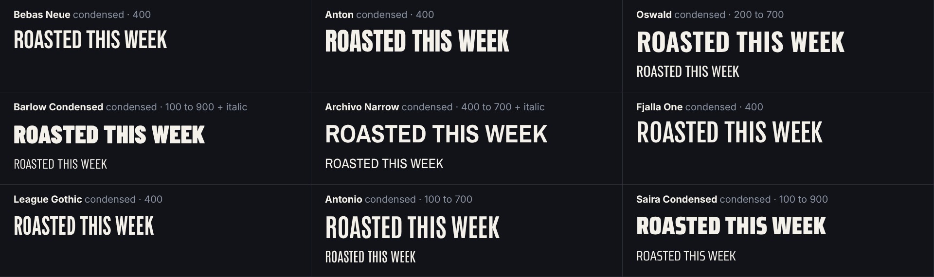
Any other Google family still works with googleFont(); the catalogue only does not describe it. For a family the catalogue lists, googleFont() refuses a weight or an italic the family does not have, and says which it has.
From code
In code the same list is FONT_CATALOG, with findFont(family) and fontsFor({ role, category }). An editor's font picker lists it.
Changing the theme
An editor changes the theme with these actions. Each undoes in one step.
| Action | Does |
|---|---|
composition/setTheme { theme, merge? } | Replaces the theme (or removes it with null); with merge, lays the parts over the current one |
theme/setToken { token, value } | Sets one palette colour, font role or radius |
font/use { id or role, family, weight? } | Sets a font from the catalogue on a title, the captions or a theme role, and declares it (A font picker) |
The first two fold into the composition's theme literal. font/use writes the font where it is used, and its googleFont() declaration when the file has none. Elements the theme does not touch keep their placements, so a swap re-renders only what it restyles.
For editor builders
Seeing where a value came from
A placement's themed maps each prop the theme supplied to its origin. The inspector reads it to show which values follow the theme.
| Origin | Means |
|---|---|
"$primary" | A token. |
"style:h1" | A preset. |
"motion" | The motion style. |
"theme" | The composition background. |
Lint
| Rule | Level | Flags |
|---|---|---|
theme-refs | error | A $token the theme does not define, or a style with no preset. |
theme-literals | warning | With a theme declared, a literal colour or font on a title, shape, SVG, sticker, captions or marker. Shadows are exempt. The message names the token when the colour matches one. |
font-available | warning | A font no renderer ships and the file does not declare. For a family in the catalogue the message gives the declaration to write; for a name close to one, it asks whether that one was meant. |
declaration | warning | A font(), googleFont(), effect() or transition() call inside a function, or with arguments that are not literal, or one neither exported nor used. |
Next
- Anatomy of an element: where
styleand$tokenssit on an element. - Titles and graphics: the elements a theme styles.
- Editing: actions, fold and lint for editor builders.